
From my bookmarks / UI resources
10 UI websites in my Vibe Coding bookmarks
Ten websites from my browser bookmarks for interface references, motion, icons, and visual themes, with practical ways to use them.
This article comes from a browser folder I named “Vibe Coding websites.” I have gathered those saved links here so you can find references while building a website, app interface, or product demo.
Clear references help an agent build an interface that matches your taste: how to arrange the page, combine colors, and use motion. These 10 websites are organized by what you need to do.
01 / 4 websites
Find a visual direction
Choose references before building. Look at layout, visual style, and individual components separately, then give your agent something more specific than “make it look better.”
Web design and prompt references
MotionSites AI
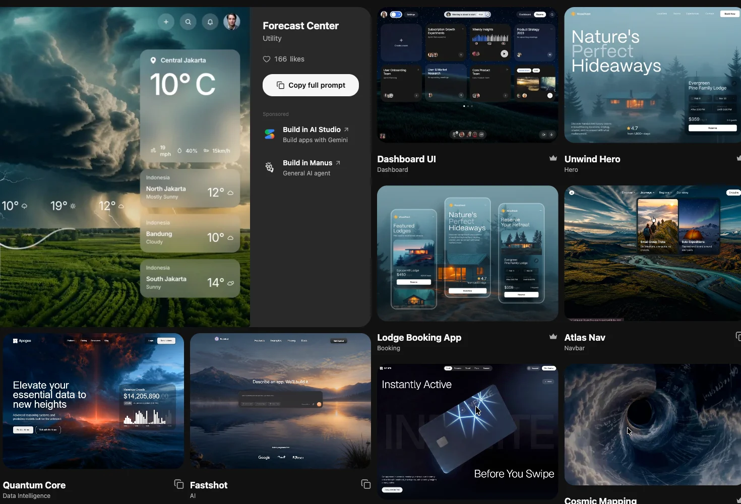
This is the bookmark I named “UI reference.” It brings together website examples and AI website prompts, with categories such as hero sections, landing pages, pricing, and footers.
Try this / Pick a reference close to your goal, then explain which layout, type hierarchy, and motion details you want your agent to follow.
Explore visual styles
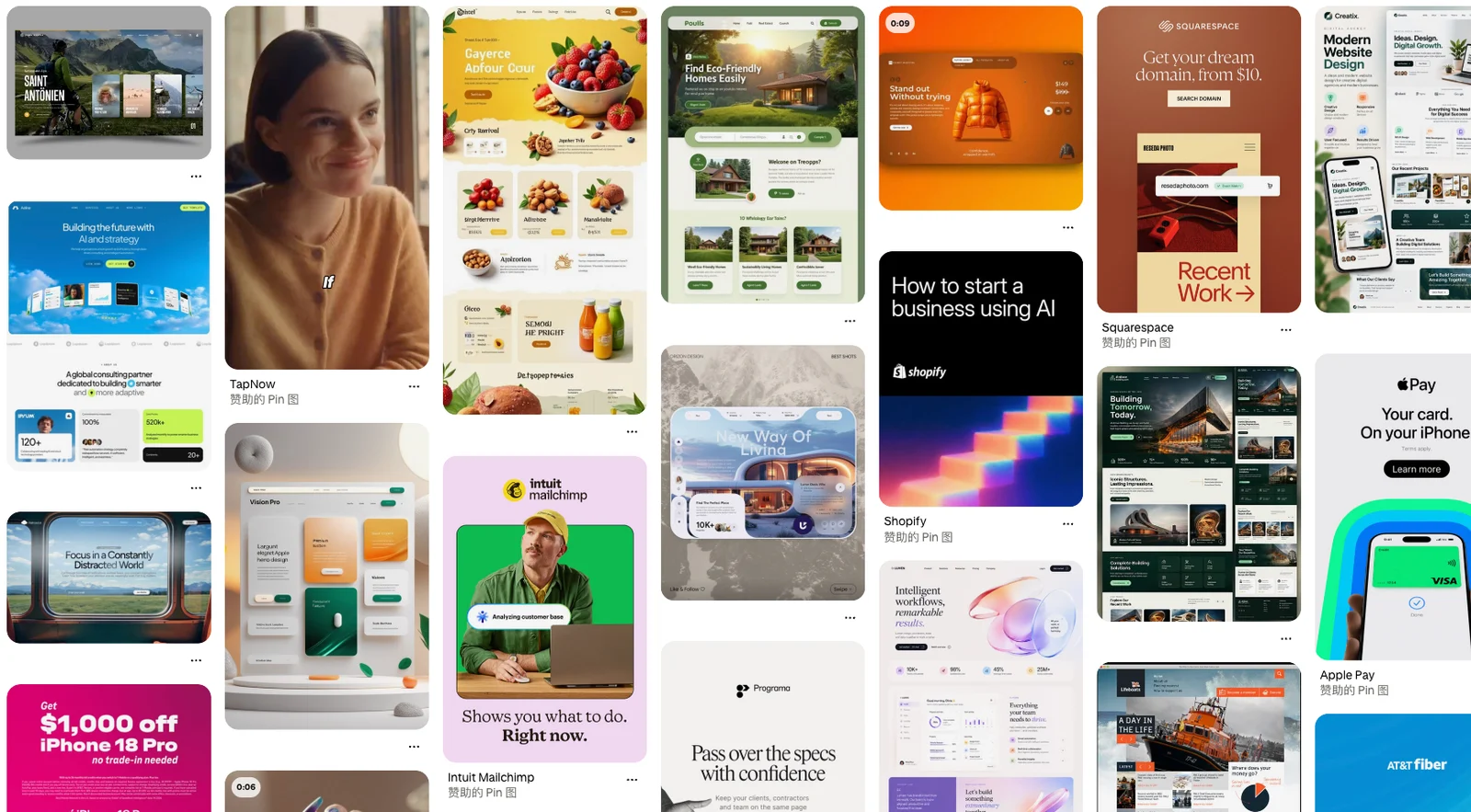
A useful reference can be a poster layout, packaging palette, or material texture. Pinterest is a place to widen your visual search before you have settled on a particular interface style.
Try this / Try searches such as “dashboard UI,” “editorial website,” or “mobile onboarding.” Choose two or three consistent references and explain what to borrow from each. Browsing may require signing in.
Study app interfaces by element
Appllama
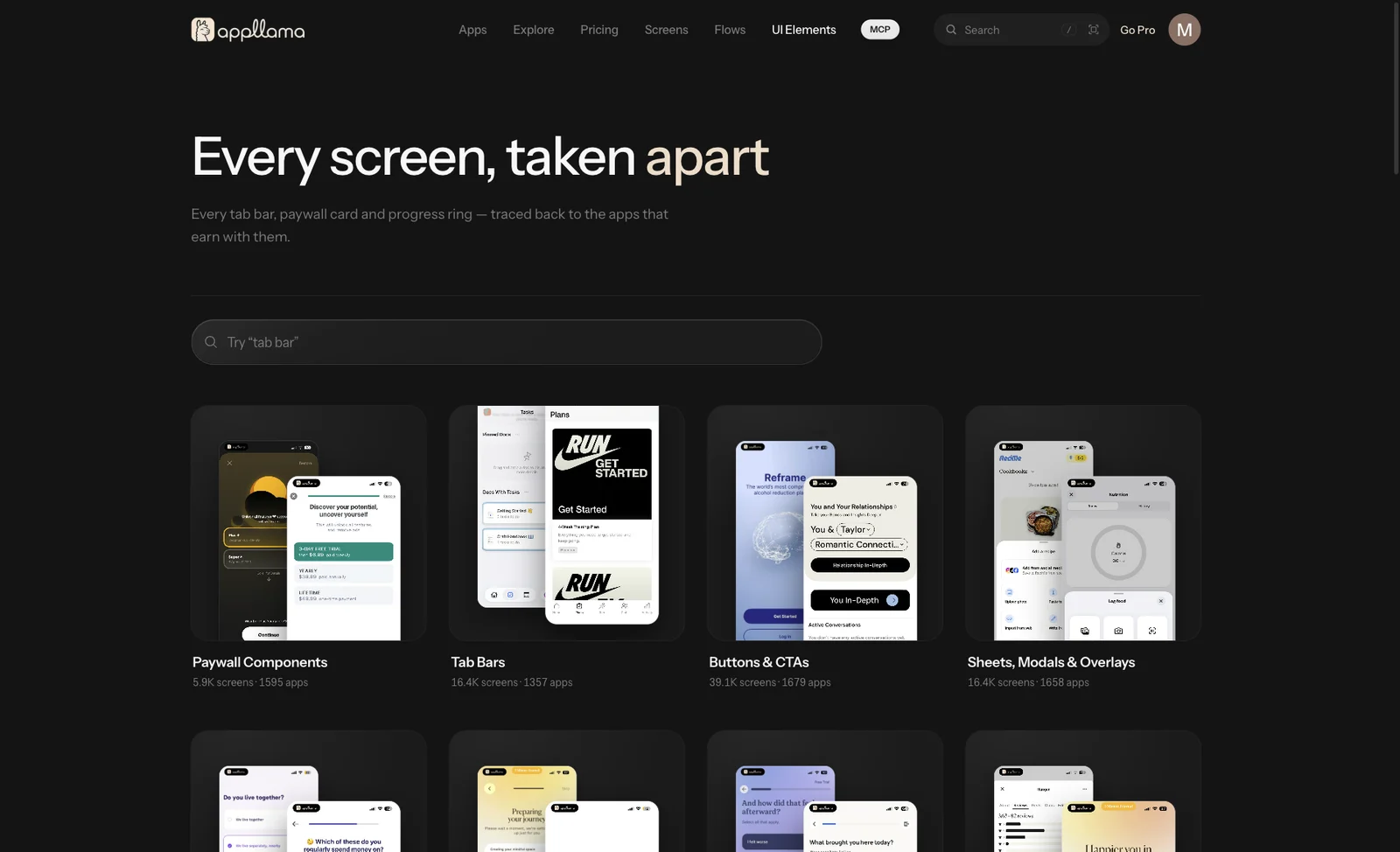
My “app UI reference” bookmark points to its UI Elements page. It organizes real app screens by elements such as tab bars, buttons, sheets, paywalls, and progress indicators.
Try this / For a mobile sheet, compare its height, action order, dismissal control, and content density, then adapt the pattern to your own task.
A directory for further discovery
DesignBookmark
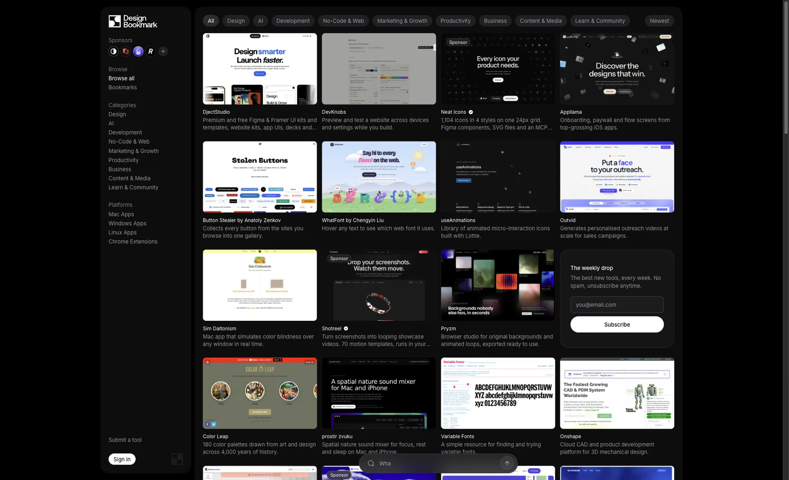
A directory of design tools, fonts, icons, websites, and other resources. It is useful when you know what kind of resource you need but have not found the right website yet.
Try this / Search for a specific gap, such as fonts, mockups, or UI inspiration. Once you find a suitable resource, return to the project and use it.
02 / 3 websites
Add motion with a purpose
These resources cover interactive components, motion references, and the prompts people use to describe a sequence.
Animated React components
React Bits
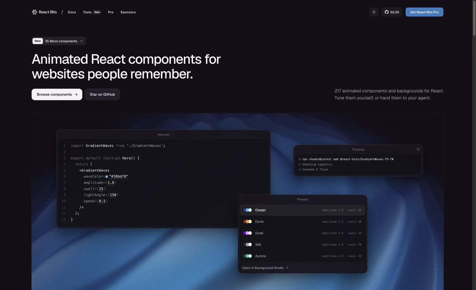
Browse demos of text animations, backgrounds, cards, and micro-interactions, then inspect how to integrate them. I also bookmarked Slosh Gauge, a liquid gauge that responds to value changes.
Try this / Choose an effect that serves the content. Have your agent integrate it into your stack, then check mobile behavior and reduced-motion preferences.
Trace motion examples back to prompts
Prompt Motion
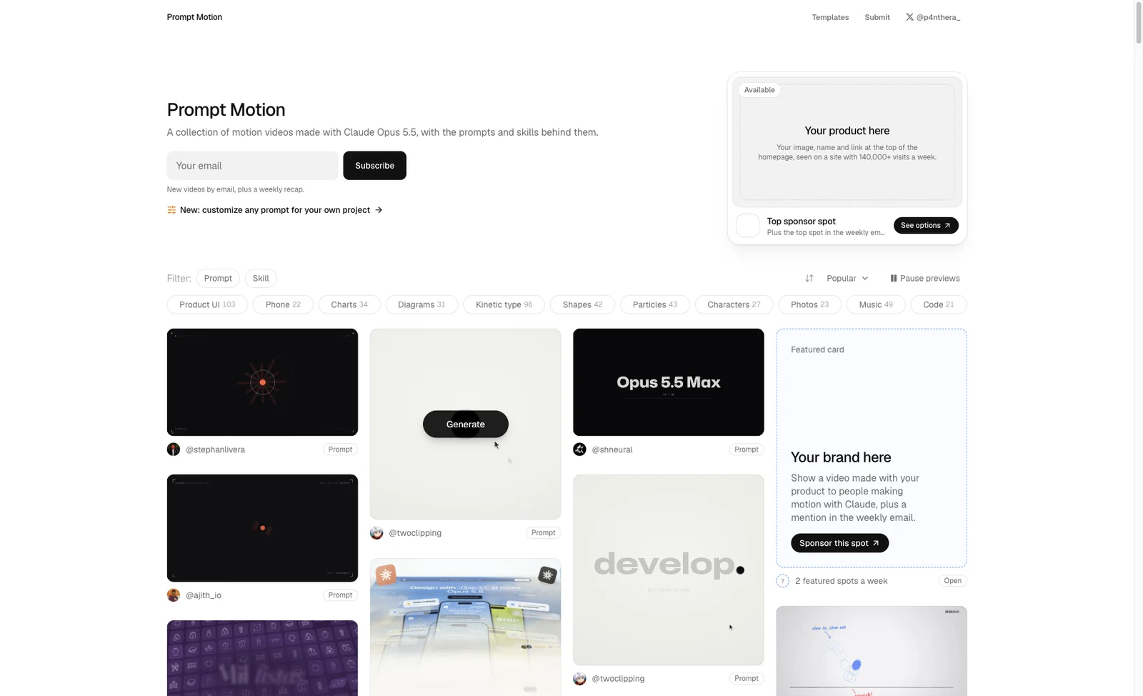
A collection of motion videos made with Claude Opus 5.5, with related prompts or skills. Tags include product UI, charts, typography, and particles.
Try this / Study the order of scenes, how elements carry into the next scene, and changes in pace. Adapt those instructions to your own content.
Compare originals, prompts, and remakes
Skillry · AI Videos
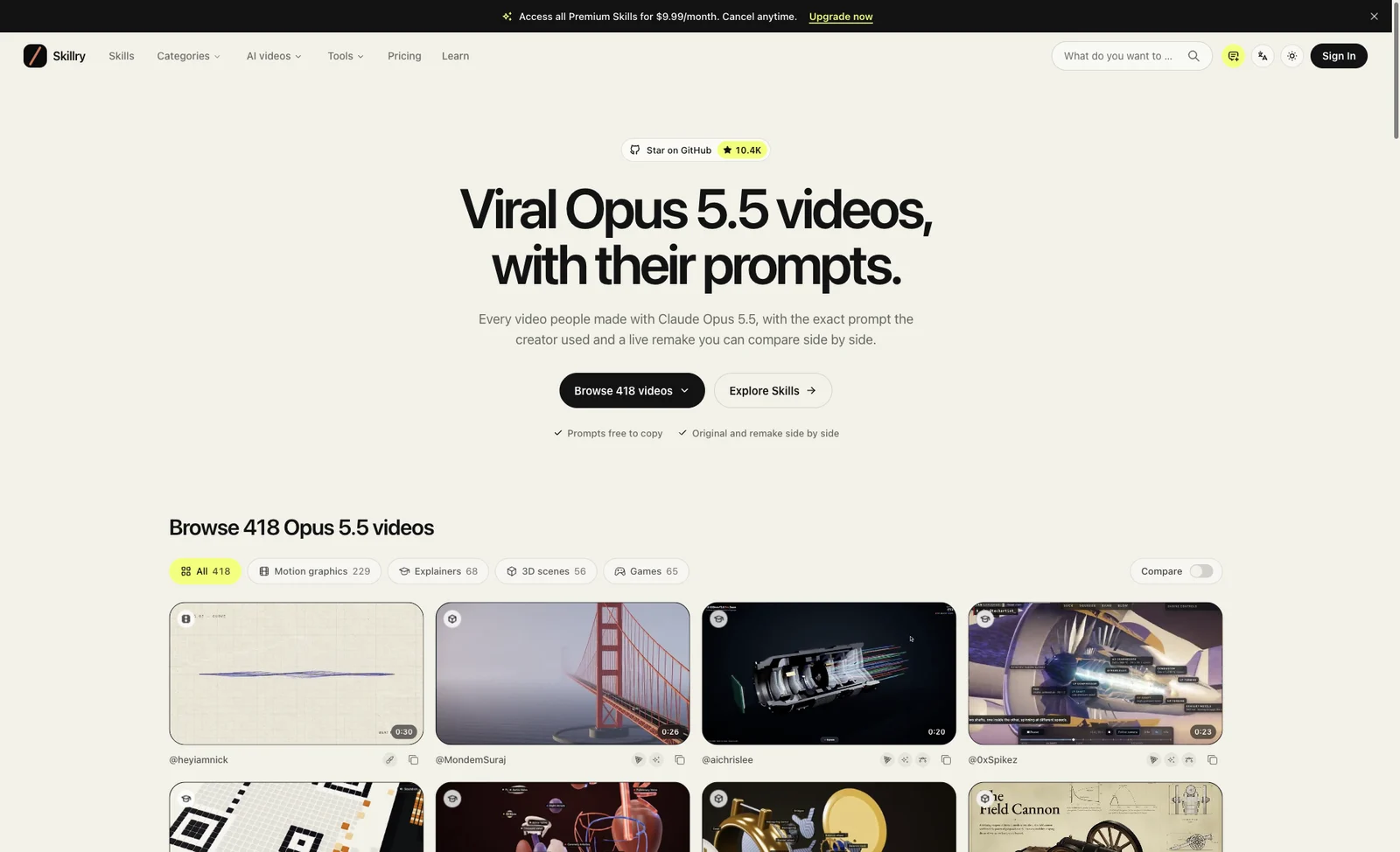
I bookmarked its Opus 5.5 video collection, covering motion graphics, explainers, 3D scenes, and games. Entries bring together original work, prompts, and remakes for comparison.
Try this / Find a case close to your task and examine the constraints in its prompt: duration, camera movement, typography, palette, and interaction.
03 / 3 websites
Make the visual details consistent
Once the structure works, consistent icons and theme rules help separate components feel like one product.
Brand icons for AI products and models
LobeHub Icons
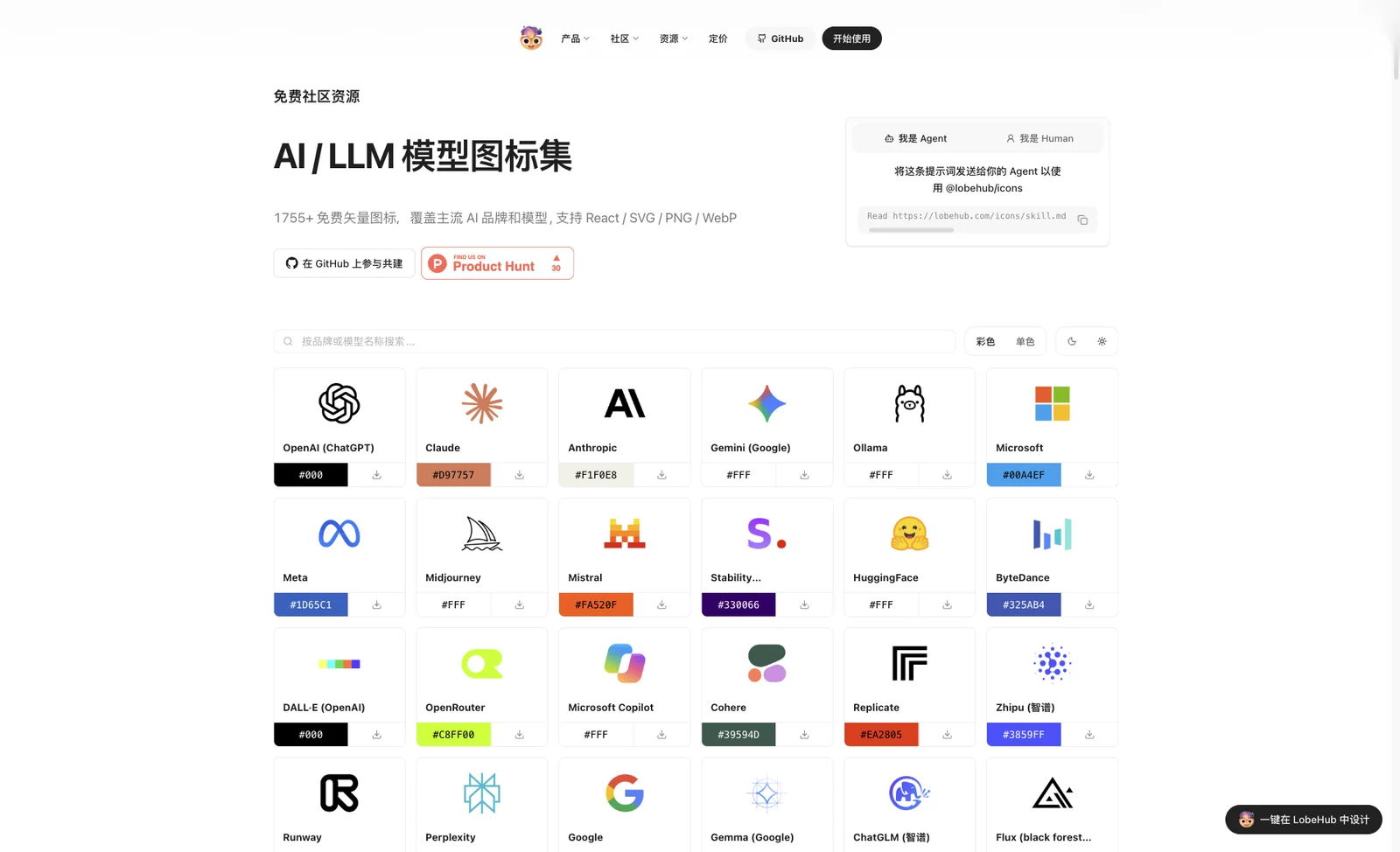
A source for AI product and model brand icons, useful for tool directories, model selectors, and comparison interfaces.
Try this / List the brands you need and choose variants suitable for your background. Use consistent containers and optical sizes so each logo remains recognizable.
Choose a consistent icon family
Amicons
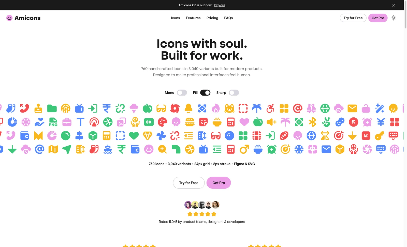
Browse icons by category and switch between line, solid, round, and sharp treatments. My bookmark opens the Religion category; use All categories to explore the rest.
Try this / Set the style first, then select navigation, action, and status icons. The site distinguishes Free and Pro items; check the selected icon before downloading.
Build a complete interface theme
Graphical
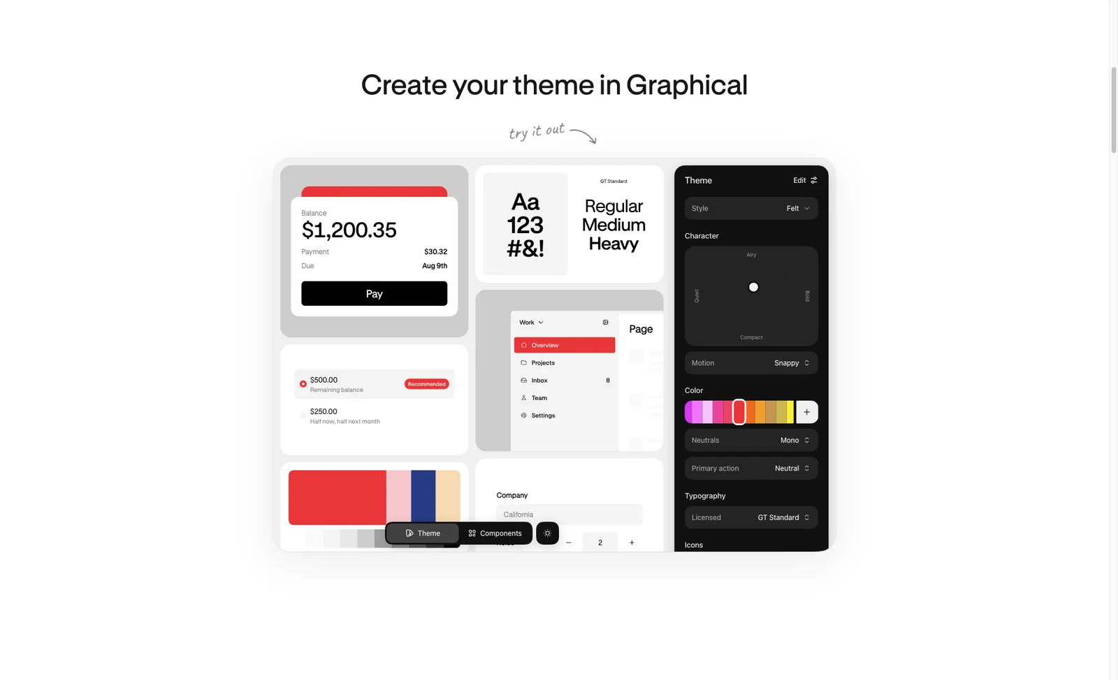
I saved this as “UI colors.” Its current site also covers typography, spacing, radii, component states, and motion, packaging themes with components and context for coding agents.
Try this / Study how a theme defines shared rules, then apply colors, type sizes, and component states consistently in your project. The full theme tool is a paid product.
04 / From reference to implementation
Turn references into a useful brief
Choose a reference close to your task, attach a screenshot or link, and tell your agent exactly which parts matter. Adapt this brief to get started:
I am building: [product and the task its users need to complete].
References / screenshots: [attach 2–3 references].
Use A for layout, B for type hierarchy, and C for the palette.
Use my project's existing stack. Start with [one specific page].
Keep my product content and unify type sizes, spacing, radii, and icons.
Use [specific motion] only in [specific location], if needed.
Check desktop and mobile layouts, plus actual button and form behavior.Finish one page, then extend its rules to the rest. Try the buttons yourself, check longer content, and use it on a phone. References give you a direction; the result still needs to work as your product.
Compiled on 2026-10-25 from my Ego browser bookmarks. Features may change, and some resources require an account or payment; see each site's current information.